Photography Art Direction
While at Beauty Brands, I've had the opportunity to concept and art direct my own photographs with an in-house photographer. After the images were finalized, I collaborated with a copywriter and creative director to build promotional print pieces around the images.
For our 2017 Summer campaign, it was important to convey the intensity of the sun (and potential skin damage that comes along with it). We were able to accomplish this portrayal through use of dramatic shadow and a vibrant yellow background.

The Amika brand has a fun, playful aspect to it's packaging. In this shot I wanted to mimic that sense of movement with the layout, while being conscious to hero their bestselling products.

This shot was done for the 2016 Lash Bash Campaign. The goal was to create a dynamic shot, while featuring out top selling mascara. We were hoping to achieve a deeper shadow on the left wall. However, depth perception and angles created challenges while shooting.

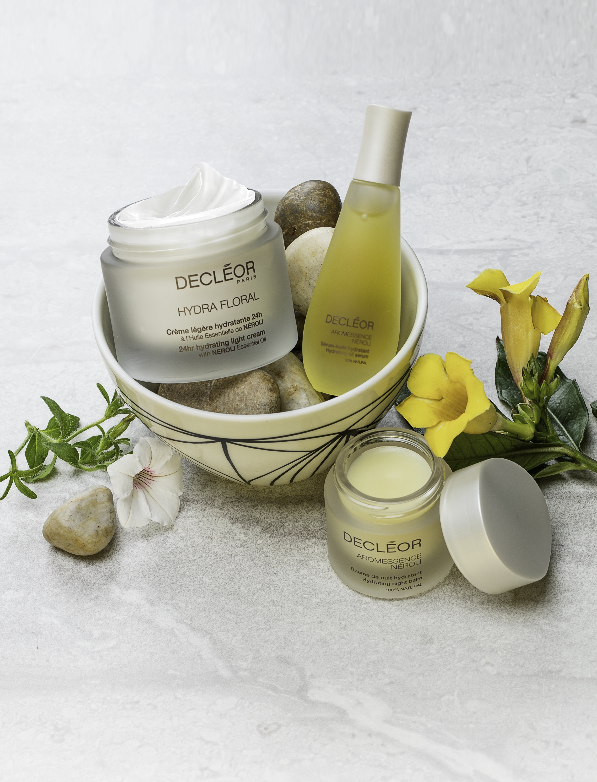
Decleor is one of our prestige brands. They put a great deal of emphasis on their use of organic and natural ingredients in their products. With this shot I wanted to capture the serenity and beauty of nature that has been utilized in their products.
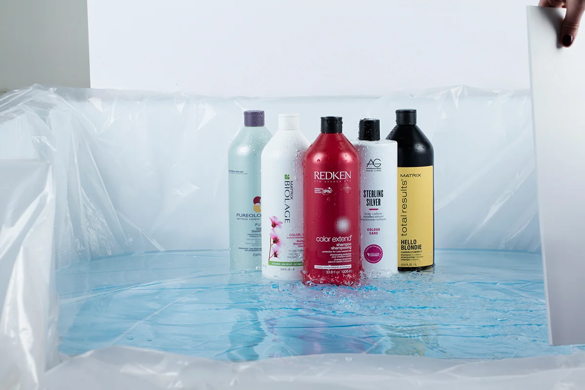
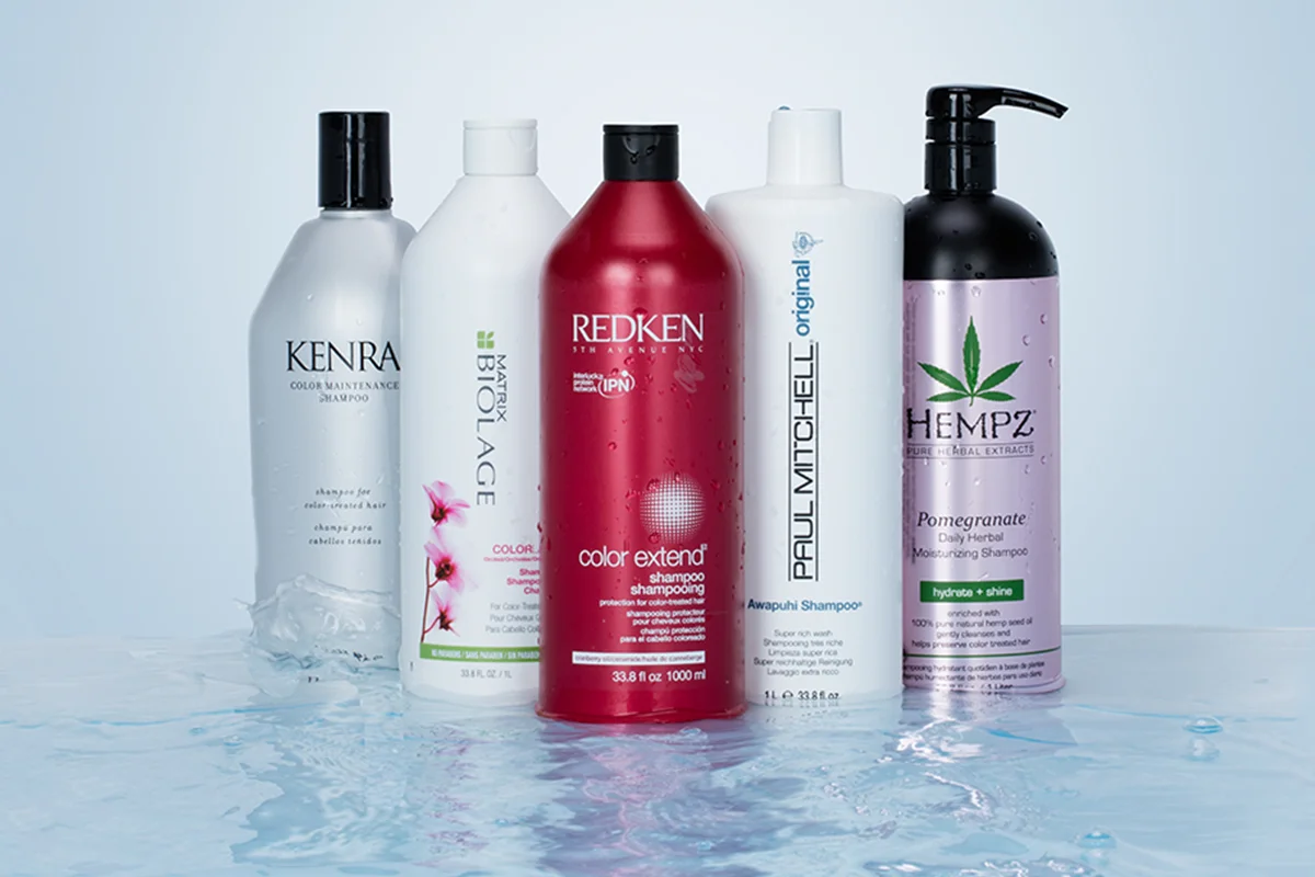
For the cover of the 2017 Liter Sale catalog, we wanted to create a realistic sense of water movement. After striking out on finding a large enough tub for the liters, we decided to create our own "mini pool" in the office. Using construction plastic, and cardboard to create waves, we were able to achieve our goal. Below is a shot of the process and following is the final shot.
Moroccanoil was featured on our cover of the 2016 Summer catalog. Much like the 2017 summer campaign, we wanted to create a sense of dramatic, intense sunlight. Creating a tone-on-ton scene allowed us to dramatize the shadows and create some really beautiful reflection from the bottles.
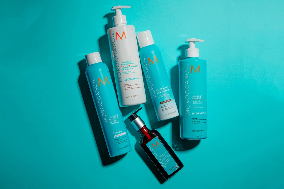
Morroccanoil I one of my favorite brands to to shoot. They have a wide range of product offering, allowing for balance of varying textures, sizes and ingredients, while maintaining a cohesive
color story.

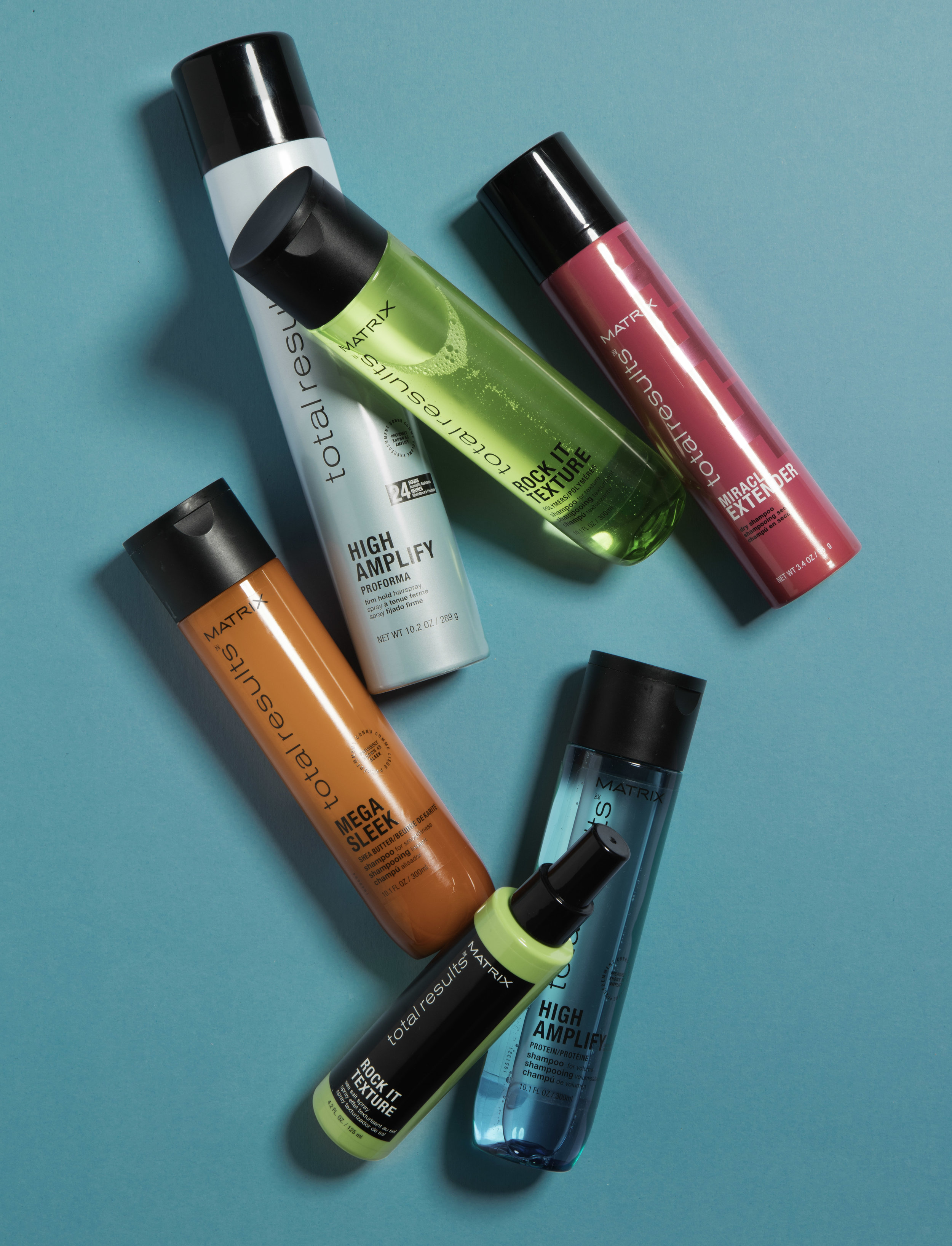
For Matrix's A-launch of Total Results new packaging, we wanted to create a dramatic,
stopping-power ad.
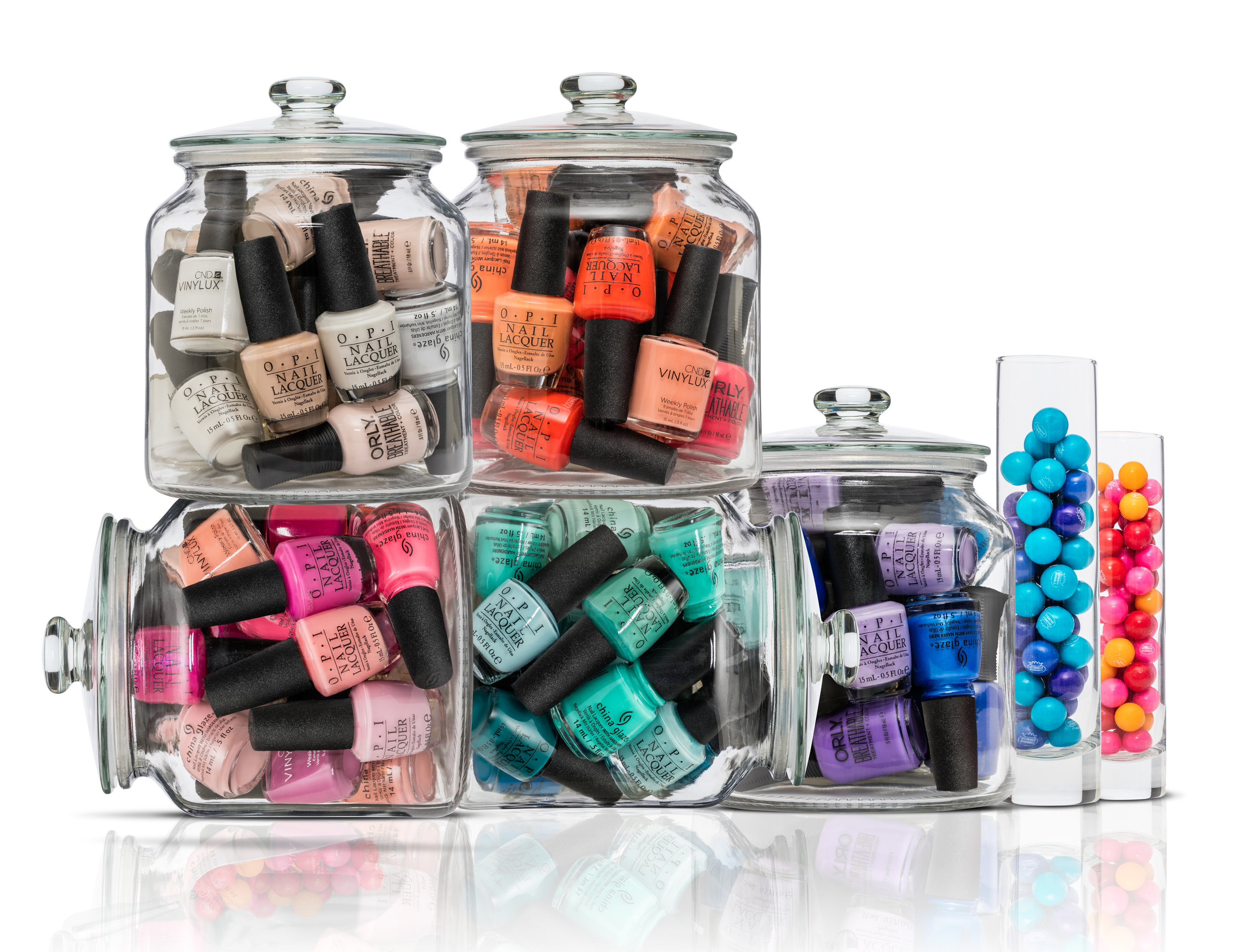
Our merchandising partner's direction on this nail promotion was to promote shopping nail polish is similar to shopping at the candy shop.
Often times Beauty Brands' largest earning promotions are on products such as shampoo and hairspray. In attempt to create a sense of newness and while continually striving to engage our consumer, we utilized greenery and dramatic shadows that make the products pop of the page. The plant in this photograph was "borrowed" from our building's lobby, and was about
7 feet tall. (The security guard took some convincing.)

Designed at Beauty Brands Inc. | Creative Direction: Stephanie Dunn | Photo Art Direction: Danielle Self Photography: Mike Prepejchal